
Accordion
This Broadcast section is filled with comprehensive accordion blocks to assist you in designing and creating engaging, interactive content. Showcase columns of diverse content, including images, icons paired with messages, and text.
Key Features
Image Columns: Display images alongside your text to create a visually appealing layout.
Icon Columns: Utilize icons to convey messages effectively, enhancing user engagement.
Contact Form: Integrate a contact form within the accordion for seamless user interaction.
Customizable Layout: Adjust the size and arrangement of accordion sections to fit your design needs.
Example
The illustration below showcases multiple accordion sections with varying column sizes, highlighting the versatility and functionality of the enhanced accordion component.
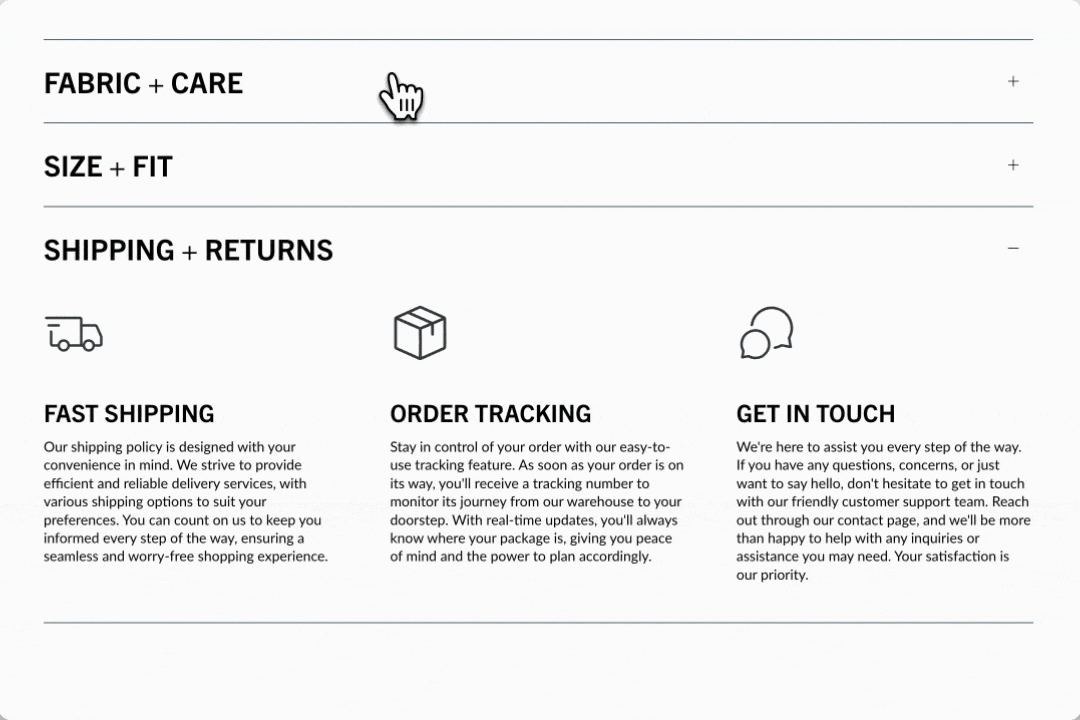
Flexible
Create engaging accordions on the home page, lookbook, product pages, or anywhere on your site. Select from a diverse set of content blocks to showcase attractive information. Combine multiple accordion sections to achieve various column sizes.
Customize
The section settings help you style the accordion's layout. The open-by-default toggle lets you keep the accordion open by default or closed.
Add blocks to build each column within the accordion. Similar block types work well together or mix them for a creative design.
The block settings help you configure each column within the accordion section.
We've included a wide range of blocks to build the right accordion quickly:
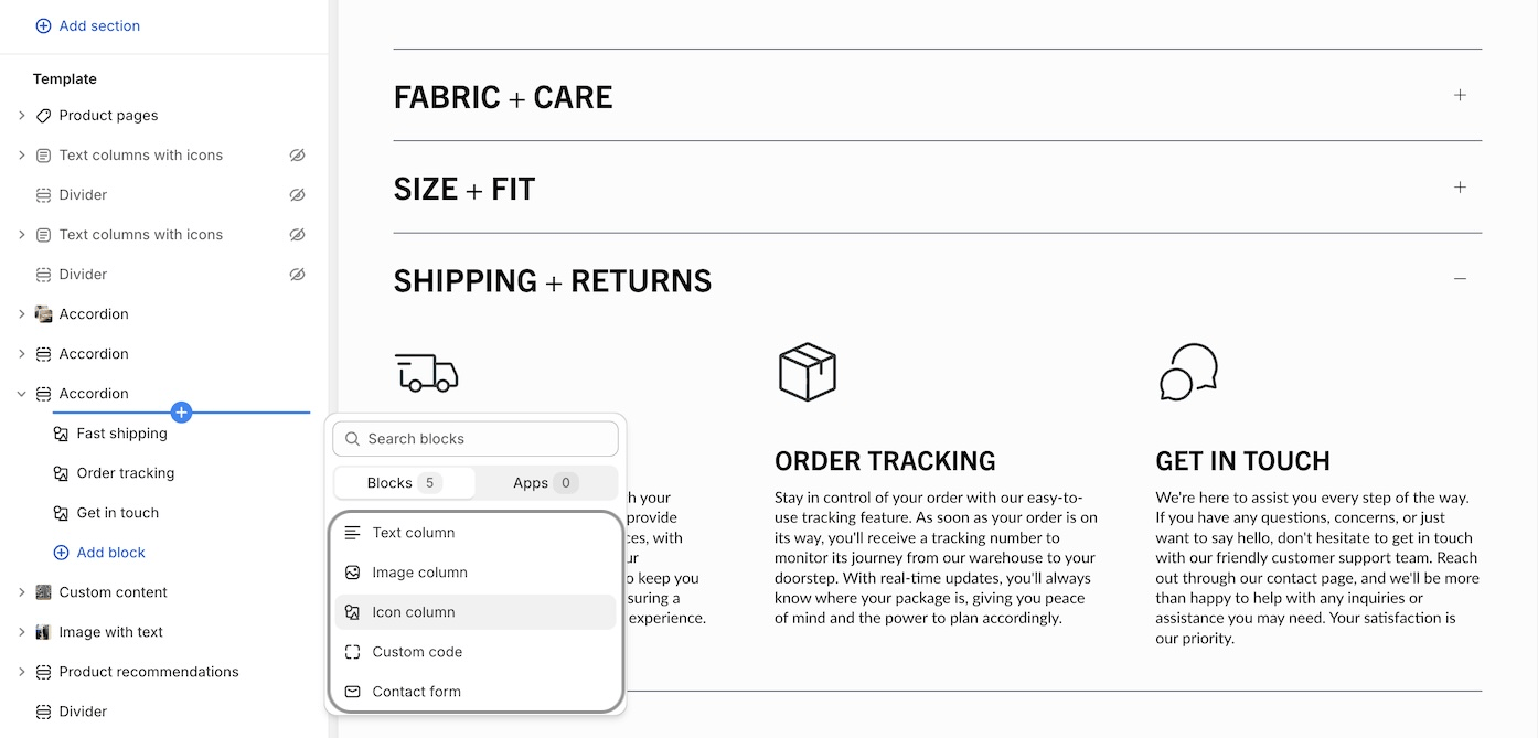
Text column - Commonly used for standard FAQ-style accordions.
Image column - Add images to your accordion for a more appealing branded experience.
Icon column - Choose from a rich set of modern icons by Broadcast or add your own.
Custom code - Build your custom accordion column with app code, HTML or Liquid.
Contact form - Incorporate a Contact form right into your accordions.
Video Overview
This video demonstrates how to create image, icon and text accordions in Broadcast: